# 405
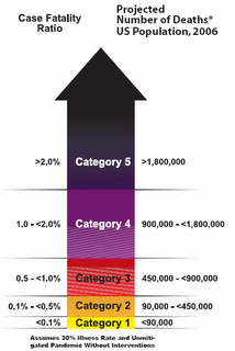
The new Pandemic Severity index relevealed last week by the CDC lists 5 levels, or categories of pandemics. A category 1 pandemic equates to a really bad seasonal flu year, much like we saw in 1977 when H1N1 reappeared. A Category 2 pandemic would describe the 1957 and 1968 events.
And the 1918 Spanish Flu would be a Category 5 pandemic.
Almost immediately, there was some debate on the net that the Spanish Flu wasn't the `worst-case scenario', and that topping out the severity index at that level didn't make much sense.
Shouldn't there be a Category 6 or 7 or even 8?
Not surprisingly, this debate has gone on in the hurricane community as well. A Category 5 storm is one with winds exceeding 155 MPH. A category 4 Storm has winds exceeding 130 MPH. By all rights, you'd expect that a storm with 185 MPH winds would be a CAT 6.
But it isn't.
At a certain point, catastrophic is catastrophic. Perhaps, if we ever see a MOAP (Mother of All Pandemics), they will create a new category. I don't know. But for now, like with Hurricanes, they've selected a top category, and have left it open-ended.
What is telling, and I suspect wasn't noticed immediately, is that by setting the top category to that of the Spanish Flu of 1918, they weren't saying that was as bad as it could get.
With today's population, a pandemic of the same severity as 1918 would be expected to kill 1,800,000 people in the United States.
If you'll look at the graphic, lifted from page 10 of the CDC's pdf file Interim Pre-Pandemic Planning Guidance:Community Strategy for Pandemic Influenza Mitigation in the United States (available here), you'll note a Category 5 pandemic starts with 1.8 million fatalities.
True enough, when officials speak of a potential pandemic, and talk worst case, they general talk about a 1918 type event. We're told a severe pandemic could claim nearly 2 million American lives. Officially, rarely do you hear numbers higher than that.
But this graphic not only shows roughly half of the graph above the 1.8 million deaths line, it puts an arrow on top of that, indicating, I suppose, that the upper limit could be even higher. A surprisingly blunt graphic from the CDC and HHS, and a hopeful sign they are looking at scenarios greater than 1918.
They say a picture is worth a thousand words.
So I guess they don't have to come out and actually say it.