
CDC U.S. Variant Update published 4/28
#15,948
The above graphic, released nearly 2 weeks ago by the CDC - while informative - is based on data current through April 10th, making it a month old today. Surveillance data, by its very nature, is always a couple of weeks old when we get it.
Most of the time, particularly when we are dealing with seasonal flu, this lag doesn't matter much. But with COVID, and the plethora of variants in play across the nation, month-old-data can be misleading, and potentially even dangerous.
We should see a new update from the CDC early this week, but that data will be current as of the 3rd week of April, and will grow only staler over the two weeks until the next update. Meanwhile new variants, like the 5 recently added VOIs, could be gaining ground largely outside our view.
Last last week the CDC added a new, experimental option to their variant surveillance page; a `nowcast' option. With the click of a single toggle, you can can change the view from `what was' to a more current estimate, based on recent trends.
While the description (below) indicates the nowcast option should change the bar chart, data table, and regional pie charts, so far only the bar chart appears to update for me. Nevertheless, it provides an additional interesting way to view the data.
Nowcast Weighted Estimates
When “Nowcast On” is selected, the bar chart, data table and regional pie charts update to show nowcast weighted estimates for the most recent 2-week interval. The nowcast estimates use a multinomial regression model of weighted sequencing data to estimate variant proportions and prediction intervals. The nowcast provides timely estimates while accounting for limited sequence data availability, as samples from that interval are still being processed. Nowcast estimates are projections and may differ from weighted estimates generated at later dates.
Bar Chart:
The bar chart represents nowcast proportions of the most common SARS-CoV-2 lineages grouped at the national-level or selected HHS region. The nowcast uses all available weighted sequencing data and a mathematical model to project current SARS-CoV-2 lineage proportions for the most recent 2-week interval.
Table:
The table presents point estimates and associated 95% prediction intervals for nowcast variant proportions of the most common SARS-CoV-2 lineages for the most recent 2-week interval at the national-level or selected HHS region.
Pie Charts:
Each pie chart represents the point estimates and associated 95% prediction intervals of nowcast variant proportions of the most common SARS-CoV-2 lineages the most recent 2-week based on sequences collected from each HHS region.
You'll find the `nowcast' version of the bar chart published on April 28th, below. As you'll see, the two biggest changes are a major jump in the percentage of B.1.1.7 across the nation (59.6% jumps to 71.7%) and the P.1 variant jumps roughly 50% - from 3.7% to 5.6%.
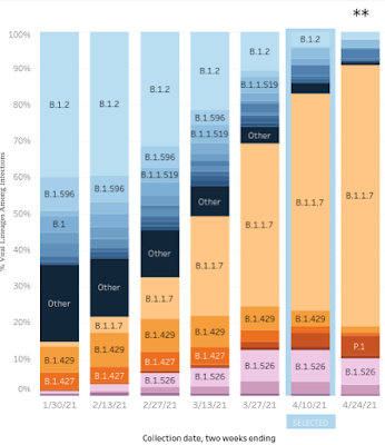
Most of the other variants on this list - including the B.1.531 from South Africa - are expected to decline in market share.
The are of course only estimates, but we should be able to track their accuracy (which will undoubtedly improve over time), with each new update.