# 4407
The CDC stopped the clearly impossible task of trying to count individual cases (and fatalities) of novel H1N1 last summer.
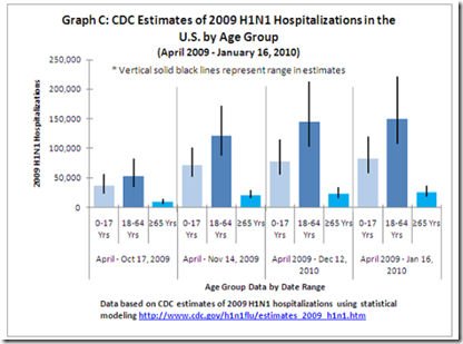
Instead, starting in October and on a monthly basis, they’ve released a series estimates of pandemic H1N1 infections, hospitalizations, and deaths across the United States.
These estimates have a low range, mid-range, and high range, and have traditionally been presented in a table format. The latest one is depicted below.
Tables are fine, but don’t convey information as easily as other graphic formats. So the CDC has updated their latest (February) report with a series of new graphic representations of this data.
I’ll just reproduce a couple of the (6) new graphs. Follow this link to review them all.


