Credit NIAID
# 7106
One of the hallmarks of the bird flu outbreak in China is how quickly the numbers change. Almost before a news article, blog post, or expert assessment can be created and published, the case count changes.
Still, stopping to examine the cases and trends as they existed 12 or even 24 hours ago has real value. When we look more than just the latest case totals, we can sometimes see patterns that can improve our understanding of an outbreak.
With that in mind, a look at three graphic analyses of the H7N9 outbreak, all based on information that is current as of the last 24 hours.
These charts will undoubtedly be updated and revised as new data comes in, and so they should be checked often.
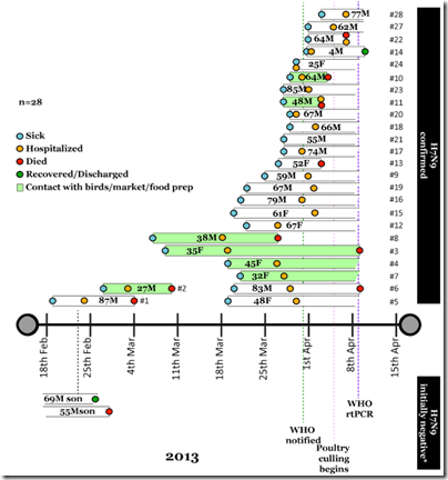
First stop, the terrific timeline chart being maintained by Professor Ian MacKay on the Virus Down Under H7N9 website.
After seeing only a couple of cases in January, the number of new cases jumped markedly between March 18th and April 1st. Recent reports indicate new infections continuing into the first week of April.
Be sure to check out the narrative provided on this webpage as well.
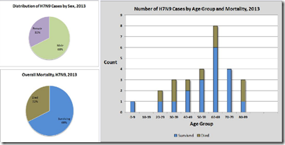
Next stop is a An Overview of Human Cases of H7N9 in China, April 9, 2013, created by Laidback Al on FluTrackers.
Al produces a variety of maps and charts at FT, and each January creates a detailed look at the previous year’s Avian flu activity (see H5N1 in 2012: The Year in Review).
Follow this link to view Al’s graphic characterization of China’s H7N9 outbreak.
And last stop, the latest Epidemiological Assessment of novel influenza A virus A(H7N9) in China released this morning from the ECDC.
While these graphs and charts may not provide us with the answers we seek regarding this outbreak, sometimes looking at the data in a fresh way can help us to ask the right kind of questions.
And from there, we may gain a better insight into what this virus is doing, and where this outbreak may be headed.


